
The Root Yoga and Gathering Space is a yoga studio whose mission reaches beyond the physical practice of yoga. The founders wanted to build a community where people could come not only to practice yoga in it’s many forms, but connect with each other and experience the support and guidance of a home away from home, a sanctuary if you needed one. Tea and a library of books are available to students and they are encouraged to stay after class to enjoy the space.
Outside of the studio mission the branding also had to reflect the strong ties to nature and the four elements, primarily earth. Pulling inspiration from southwestern and Native American cultures some preliminary sketches and textures were born. We wanted the logo to feel like it had been carved out of the earth, so maintaining textures that evoked a visceral feeling were important. We carried this element throughout the branding, creating a hand-drawn pattern that could be used alongside the logo in marketing materials and the space itself. With these elements at play the supporting typography and part of the logotype we designed were solid, clean, and modern so the grounded feeling of the brand as a whole could be felt in one glance.
Once the logo was complete we created the storefront signage, consulted on the colorscape and design of the space itself, and designed marketing materials.
Inspiration + Sketches


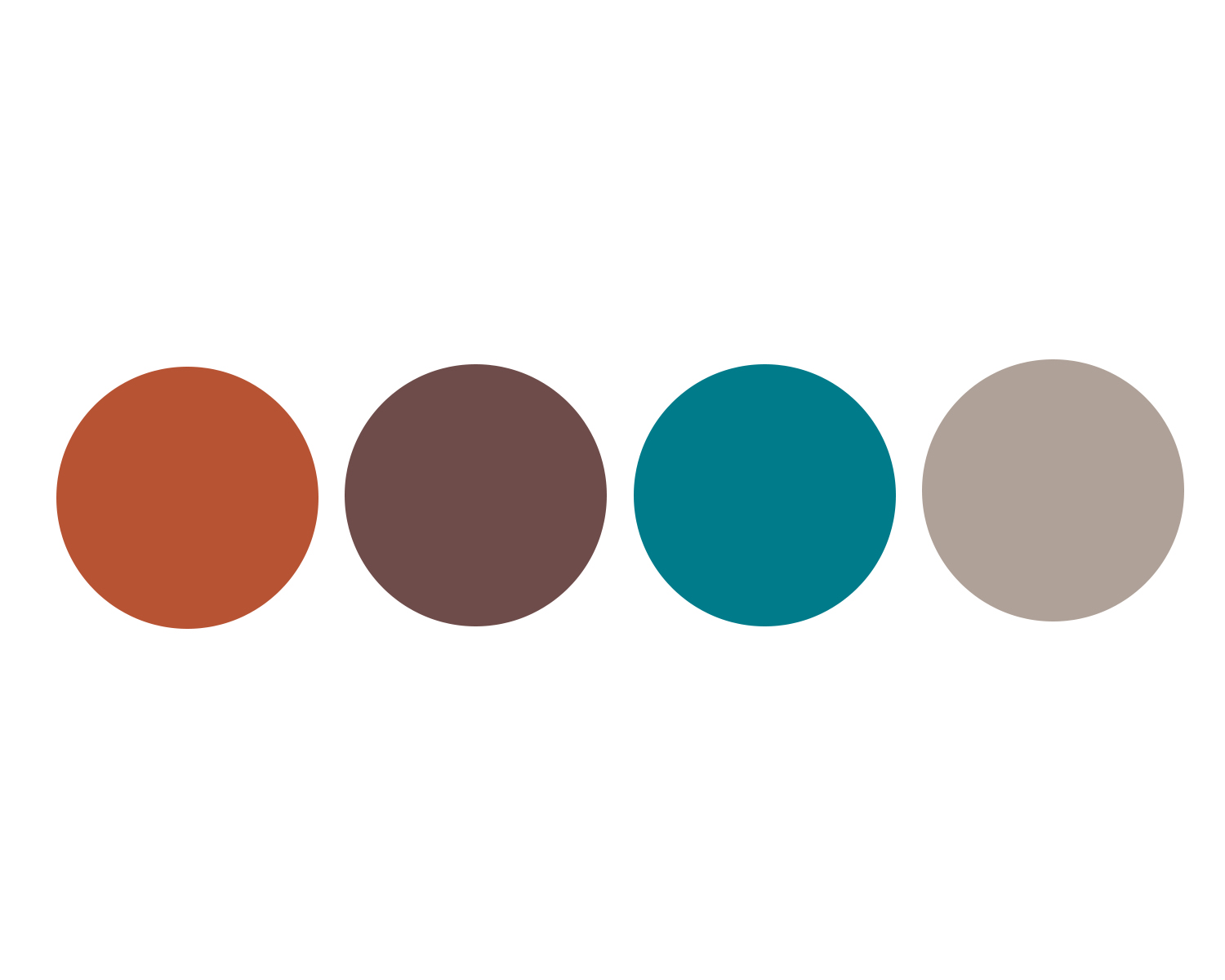
Color Story + Typography

Patterns + Textures
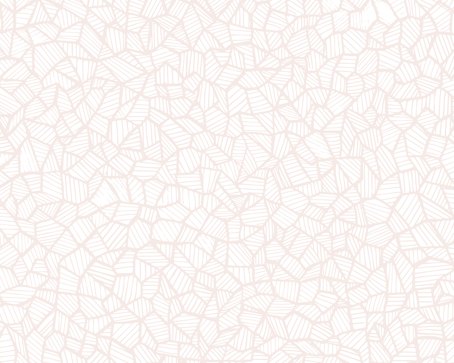
hand-drawn element
